Just finished my Specified Outcomes several minutes ago, I found there is a lot of other things need to do. Like feeding me, preparing Discovery Day’s PPT and presentation, and the last horrible but exiting assessment display.
I feel more stressed about my project now. Because it is seem that I need to prepare a lot of works to show but I did not do a lot in this semester. I did a lot of observation, showed pictures to people and interviewed my Chinese friends through Internet in order to collect their opinions about dental practices and hospital. They gave me some valuable advice and encourage me to complete my project.
The books I borrow from our library made me feel happier and happier. Some of them are recommend by my supervisor- Carol. She is a good lady, she gives me useful advice and help me to think deeply and widely.
Now I need to start doing a huge number of sketches for my prototyping and then figure out a good and quick way to finish prototypes without toiling with them for too long. I think next semester will be happy and toilful. Lots of doing and less of asking and thinking. It's easier to gauge how much I'm doing since I will be able to see it and touch it. The worst thing is I had a bad feeling that I had done nothing during this semester and other classmates try their best to prefect their projects.
So I need to try my best to do my outputs.
2008年5月6日星期二
2008年5月2日星期五
Discovery Day Rehearsal
Today we do Discovery Day Rehearsal. I found I make a big misunderstand about five pictures …… I am so stupid that product so ugly PPT. It makes me so shame that I want to kill myself. From watching other people’s display, I have some ideas to modify my PPT.
I found that they are good at collect information and compare with other similarities. I think I can study their methods to explore my project.
Communicating with friends is interesting and helpful. Different people have different minds, studying from others to enrich my knowledge.
After the rehearsal, I think five minutes is a very short time and our projects have too much information. It is different to clearly explain my project in such a short time especially some of audiences are unfamiliar with my project. So I need to spend most time on basic knowledge. At the same time, I can use part of images and diagrams from Specified Outcomes. Images and diagrams are much more direct in communication, which is one of the results from my project.
In my project, it is found that many hospitals introduce visual arts into interior space in order to produce a welcoming area for patients. Actually, the visual arts not only have an affect on patients, they also influence staff. They aim to create an environment which would be stimulating for patients as a catalyst for physical movement, a visual aid for staff when treating patients and a pleasurable environment to work in. Data from NHS trust indicates that owing to better patient environment and improved staff morale, the medical outcomes including recovery rates and stress level are improved by arts in healthcare programs.
2008年4月30日星期三
The horrible thing is over
I hand in my Context & Cohesion paper on time. Actually I spend a long time on it because it is very different for me to write academic paper. To be frank, as a foreigner, I am not good at using the second language to writing. I always make a lot of mistakes. When I requested my classmates to proofread my paper and they corrected lots of low mistakes I felt so shame. My classmates are very kind and glad to help me.
I think I spend half of Easter vacation on preparing the academic paper and changed it several time. I also booked Writing by Appointment in order to find some help from professionals. Actually the lady gave me some advice to my paper, I followed that putting some visual pictures into my paper in order to make paper easier to understand and it is a good way to explain some thing which is different to describe only by word.
The next thing is preparing the Discovery Day Rehearsal. Five pictures need to produce.
2008年4月20日星期日
Some thing I learn from my project
In order to design a healing dental environment, the first thing that should be known is the common causes of dental fear (Dental Fear Central 2004-2007).
- Bad experiences: studies suggest that about 80 -85% of dental fear is caused by bad or horrific dental experience.
- A history of abuse: a person who has a history of bullying or having physical or emotional abuse, especially in childhood, may contribute to developing dental fear, especially in combination with bad experiences with dentists.
- Uncaring dentist: a dentist who is perceived as cold and controlling. This has a huge psychological impact on patients.
- Humiliation: insensitive remarks and the intense feelings of humiliation they provoke are one of the main factors, which can cause or contribute to a dental fear.
- Vicarious learning: affects of other people’s experience. If a parent or other caregiver is scared of dentists, children may pick up on this and learn to be scared as well, even in the absence of bad experiences. Also, hearing other people's horror stories about visits to the dentist can have a similar effect.
- Preparedness: people who quickly learned to avoid the needle in order to escape hurt, but they still face the dental needle when treated.
- Post-traumatic stress: Research suggests that people who have had horrific dental experiences (unsurprisingly) suffer from symptoms typically reported by people with post-traumatic stress disorder (PTSD). This is characterized by intrusive thoughts of the bad experience and nightmares about dentists or dental situations.
Many healthy professionals give a wide range of ways to solve dental phobia. Some ways are used in present treatment. The solutions mostly be used are hanging images on the walls and drawing murals on ceiling and walls. In many surgeries, dentists like using scenic photographs or pictures, especially, a beach, a sea, a lake or a forest. These images do their work to some extent. From first hand experience in dental practices, when people lie on dental chairs, sometimes they can not see the images because their views are always filled with dentists’ hands or dental equipments. Hanging mobiles like birds or fish is another common practice. But it also does not work for the same reason as the images mentioned above. If the images or decorations are too small to absorb patients’ attention, they will not work. As a result these kinds of images are suitable in the waiting room or corridor.
Watching video eyeglasses and installing DVD players are the other two modern techniques, patients often find video glasses novel, but many feel claustrophobic or cut off from their surroundings and to patients with serious dental fear or those suffering from pain finds it difficult to concentrate on the video. Doctors also sometimes feel cut off from the patient since they cannot see the patient’s eyes or expressions (Maklin 2002, p.448).
After interviewing and observing dental practices, hospitals and some similar institutions, it obviously shows that “bright”, “strong”, “vivid”, ”warm”, are words that people might use to describe their impression of the visual arts and designs they like. Some of the words may be chosen with the intention of conveying the visual attributes of the appearance, the hue, the lightness and the intensity of the color, and the other words chosen are an attempt to convey an emotional response that the observer associates with the visual arts’ appearance. In other words, people pay more attention to active, welcoming and stimulating things.
2008年4月10日星期四
Two bookmarks for our magazine
 In order to broadcast our magazine -- Spark, I design a couple of bookmarks.
It is the sign of our magazine on the top of the bookmarks, this sign is designed by Divya, who is one of my classmates from India and she is a graphic designer, I like her drawing works very much.
Followed by the subtitle of this magazine, which is in the middle of these bookmarks, it is our course and the name of college.
I use the three colors to balance the image, and these colors are from the sign. “Less is more.” Meaning that the notion that simplicity and clarity lead to good design. It is often associated with the architect and furniture designer Ludwig Mies Van Der Rohe (1886-1969), one of the founders of modern architecture and a proponent of simplicity of style.


After design these bookmarks, I sent them to Michelle, who also is a graphic designer, and asked her to help me to refine it. About 10 minutes later, she sent them back, they were more beautiful!
For me, it is difficult to balance more than three kinds of colors. Even I like complicated shape, colour and image, I would like use black and white and another color to express in my works.
I send these to my father to ask for his advice and he says they are simple but very obviously and powerful, but the biggest problem is he does not understand the meaning of the bookmark because he does not know a little bit English and it is my aim. Asking a foreigner to apprise is a good way to inspect the image for international because he will ignore the words and pay attention to the whole frame of the picture.
2008年4月2日星期三
Article paper for MDes magazine – Spark
 Avoid Dental Phobia
----- Five tips forwards designing a healing interior space for patients
Every year, millions of people experience unnecessary discomfort, distress and even depression because of health problems with their teeth, gums and mouth. So dental health should be very important to everyone at least to who has teeth because we need teeth to do the first digestion – chewing. The good teeth associate with good health. But dental treatment always associates with pain and uncomfortable. What do dentists do during this situation?
 Querying Yes/No questions as patients lie on dental chairs during their treatment is a specialty for dentists to achieve in order to distracting patients’ attentions from pain or discomfort. “The dentist should be good at asking Yes/No questions, I think.” A young postgraduate client said, “It is a beneficial method my dentist uses during teeth treatment and it makes me think about other things and not focus on the pain from my teeth.” But if the dentist is not skilled in communication and chat, why not using the interior space to heal them?
After interviews and observations in dental practices, hospitals and some similar institutions as well as literal review, there are at least five usual solutions have been used in contemporary dentists to deal with dental phobia in interior design.
Firstly, putting some attractive pictures on the wall or hanging decorations on the ceiling opposite the dental chair is a traditional mode that has been used in many dental surgeries, and it has worked to some extent. In many surgeries, dentists like using scenery photographs or pictures, especially, a beach, a sea, a lake or a forest. And hanging toys like birds or fish is another common practice. However, from first hand experience in dental practice, when people lay on dental chairs, their view is always filled with dentists’ hands, treatment facilities and ceiling. At that time, there is no space for pictures or decorations and as an obvious result they do not work. Sometimes the images and decorations are too small to absorb patients’ interests.
Why not a TV in the treatment room? Actually, this is controversial. From the patients’ view, watching TV series during treatment is an enjoyment and the pain seems to be forgotten with the help of funny programmes. But from the dentists’ view, the TV programme also distracts them from treatment. A dentist stated: “It is dangerous! If there is a TV set and it is playing interesting programme, I will pay attention to that not on my work. In my opinion, even a lot of patients advise me to install a TV set in treatment room to alleviate their pains during treating; I prefer images to a TV set.” In many case, the opinion of patients and staff is that the TV set is suitable only for waiting room.
Furthermore, to decorate the ceiling as a focal point in the treatment room is an appalling disregard for the ceiling design and aesthetic dimension of a ceiling. With smart interior design through the use of creative materials and finishes the ceiling can become the focal point or an important backdrop for other interior elements. Add welcoming dimensions to dental surgeries by bringing decorative ceiling element. In this way, patients could enjoy the creative ceiling design during treatment. But the disadvantage is the ceiling decoration is not easy to change in a short time. People have a habit of abandon the old for the new, so a beautiful decoration, mural or image will lose its charm after long time use.
So what about changing the images in an easy way? The technique of back-lit film images or transparencies is always used in CT scan room and radiation therapy room and it can be introduced into dental treatment room. In this method, it could give patients different views of nature and open the interior space, providing a psychological escape for patients and a stress- reducing diversion.
Last but not least, there are other modern techniques to be used – a Snoezelen room. This is consists of a system of lights that are programmed to gently move and change throughout a room’s interior; it is intended to relax and calm those who are agitated,
 whether because of mental illness, learning disability or behavioral problems. This room is specially designed to deliver stimuli to various senses, using lighting effects, color, sounds, music, scents, etc. Ideally, Snoezelen is a non-directive therapy and can be staged to provide a multi-sensory experience or single sensory focus, simply by adapting the lighting, atmosphere, sounds, and textures to the specific needs of the client at the time of use. There is no formal focus on therapeutic outcome - the focus is to assist users in gaining the maximum pleasure from the activity in which they and the enabler are involved. An advantage of Snoezelen is that it does not rely on verbal communication and may be beneficial for people with profound autism, as it may provide stimulation for those who would otherwise be almost impossible to reach.
In conclusion, it is hard to think of anything more depressing to patients than the view of empty, dreary walls and ceilings as they lie on the dental chair that unfortunately still characterize so many of today’s surgeries. Dental practices need the balance of elements such as wholeness, happiness, health and fun because for hundreds of years dental practices were associated exclusively with suffering, pain and anxiety. No one is ever happy over the prospect of having to enter a dental practice, even when the patient knows it will be of great benefit to do so. A well designed interior space especially ceiling will attract patients’ attentions and heal their depression from painful and horrible treatment and place them in a holistic environment.
2008年3月28日星期五
Literature review 5 - Healing the hospital environment
Healing the hospital environment
-Design, management and maintenance of healthcare premises
This book is a cyclopaedia of how to design, managen and maintain the hospitals. It is divided into ten chapters and each chapter could be divided into at least five parts. It describes the establishment from floor to services in detail and shows products and materials and some other thing very clear.
The general appearance, interior design and environmental quality of hospitals and healthcare buildings have an important influence on patients, staff and the public. But many hospitals and healthcare environments fail to create a positive impression. This book identifies why many NHS buildings do not look or feel welcoming and why even well-intentioned efforts to make improvements are unsuccessful.
The author show that significant improvements can be made within limited resources if hospitals recognize what can be achieved, set standards and invest in the relevant design expertise.
This practical and accessible book is written to inform those who are responsible for these important public buildings what can be achieved. It gives a wide range of examples of effective improvement in design, management and maintenance of all types of hospital and healthcare premise and their surrounding land. It is also intended to help design professionals adapt to the particular requirements of these buildings and their wide range of functions.
From this book I found a very interesting thing which I have not heard before - Snoezelen room.This is consists of a system of lights that are programmed to gently move and change throughout a room’s interior; it is intended to relax and calm those who are agitated, whether because of mental illness, learning disability or behavioral problems. This room is specially designed to deliver stimuli to various senses, using lighting effects, color, sounds, music, scents, etc. Ideally, Snoezelen is a non-directive therapy and can be staged to provide a multi-sensory experience or single sensory focus, simply by adapting the lighting, atmosphere, sounds, and textures to the specific needs of the client at the time of use. There is no formal focus on therapeutic outcome - the focus is to assist users in gaining the maximum pleasure from the activity in which they and the enabler are involved. An advantage of Snoezelen is that it does not rely on verbal communication and may be beneficial for people with profound autism, as it may provide stimulation for those who would otherwise be almost impossible to reach.
2008年3月25日星期二
Literature review 4 - Traditional paints and finishes
Traditional paints and finishes
--How to use natural materials and authentic techniques in today’s decorating
Fashion in decoration is always moving on, and the trend today is towards a rediscovery of traditional paints and paint effects. Their softer, subtler colors enable today’s homes to reclaim the look of earlier times. As these paints become increasingly available, more people seek instruction in their use.
This book meets all the needs of the do-it-yourself decorative painter. This comprehensive guide for the novice and the experienced reveals the classic techniques used by house painters, furniture paints, artists, and restores. It provides step-by-step instruction in the traditional skills and materials used in wall coating, decoupage, lime washing, and glue painting, as well as more complex techniques for fresco, decorating with bronze powders, oil-gilding, and lacquering.
In addition, it provides information on the paints that are available today and how to obtain them. Starting with how paints are made and which paint is suitable for each task, the book demonstrates the wild variety of colours and textures that are offered. It gives detailed instructions for making patients from natural pigments and other basic ingredients, and included a list of artists and suppliers.
I know that doing DIY is very popular in Britain, and there are lots of TV programmes which show people how to improve their homes.
Some people stick to simple decorating – putting up wall-paper and painting walls. But there are all sorts of DIY projects that some people decide to take on, from laying new flooring, to plumbing, such as putting in a new shower, or tiling walls.
Unfortunately, some people bite off more than they can chew, and start doing a job which ends in DIY disaster. For example, it’s recommended that anything electrical should be done by a qualified electrician, but many people ignore this warning and put themselves in danger.
There is also a huge market for flat-pack furniture which you put together yourself with a few basic tools. Often people who are not very savvy about DIY find the supposedly simple instructions impossible to follow, and it's easy to build a piece of furniture which is unstable or just not very attractive!
Gardening is also popular, and a good way to enjoy the weather on a sunny Bank Holiday. But it’s not as simple as planting plants and doing some weeding. More complicated work such as building a new patio or some decking can cause some stress and back-ache!
So why do people do it? Who knows, maybe we are so used to working that we aren't very good at relaxing. One thing’s for sure, though a lot of DIY or gardening projects will be started with the best intentions during the Bank Holiday weekend, many of them may not get finished!
2008年3月19日星期三
Teamworking workshop
I have a whole day team working workshop today. Too tired!
To be frank, it is not a good memory to work my brain continually whole day.
After communicating with partner about the goals, the skills and so on, we achieve a consensus about the subtitle and the timetable about process. Our publication has a good name – Spark. I gave this name and in my opinion spark is a flash of light produced when two hard substances are struck together, just like our fleeting inspirations on design. The subtitle is '…is the fusion of culture, discipline, practice and reflection'. We think this for a long time, and argue this for a long way.
The result is absolutely good. We decide the timeline in order to produce our publication on time. We draw the timeline on the floor in our studio. It is amazing work by Nevada! The style is totally different from mine; her style is cute and innocent. Actually I like her drawings and paintings very much.
The thinking way is very different between different nationalities. We don’t decide things like this we always do it very quickly and divide the jobs at first. We focus on the result and the process is not cared. In another words, we don’t enjoy the process. But from work with UK people, I found it is very interesting during the process.
2008年3月12日星期三
Literature review 3 - The art of good health using visual arts in healthcare
Read this book I found that the arts have never had a more substantial role in healthcare than they do today.
The benefits include:
·Breaking down barriers between hospitals and local communities
·Improved health outcomes
·Improvements to the physical environment
Art in hospitals can provide therapeutic activity for patients and carers. It offers a welcome distraction for those who are ill, or who are visiting loved ones that are ill. It provides a more pleasant working environment for staff and can be used by them to communicate information more effectively.
This book showcases some inspiring examples of the creative application of visual arts in healthcare environments and examines its history and benefits to patients and staff alike. It is complemented by The art of good health: A practical handbook which provides a wealth of advice and practical information to trusts wishing to either instigate their own arts projects or enhance existing programmes.
The use of arts in healthcare has a long history – dating back to the ancient civilizations. Fast forward to the 21st century and the arts in healthcare is a rich and varied area of activity which is rapidly developing in the UK and abroad.
The visual arts are the focus for this publication, but other arts activities involving music, performing arts, storytelling and workshops for patients are becoming more popular both for their therapeutic, as well as aesthetic, benefits. These activities should be acknowledged for their great value in the health services.
Equally, therapy using the arts – be it dance, drama, music or art – is recognized as an integral, evidence-based, psychological and creative tool for improving physical and mental well-being.
2008年3月7日星期五
Visiting The Lighthouse
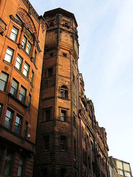 Today I have an interesting trip in The Lighthouse in Glasgow.
The Lighthouse in Glasgow is Scotland's Centre for Architecture, Design and the City. It was opened as part of Glasgow's status as UK City of Architecture and Design in 1999.
The Lighthouse is the renamed, conversion of Charles Rennie Mackintosh's 1895 Glasgow Herald newspaper office. The centre's vision is to develop the links between design, architecture, and the creative industries, seeing these as interconnected social, educational, economic and cultural issues of concern to everyone.

One of the stunning features of The Lighthouse is the uninterrupted view over Glasgow's cityscape from the Mackintosh Tower at the north of the building, which is accessible via a helical staircase from the third floor. The color and shape are so amazing and fascinating that I take lot of pictures in that staircase. From the top of the tower, I have seen elegant buildings around The Lighthouse which have a long history and full of Scottish features.
In the main building, there is also another modern viewing platform at the south of the building, which forms the buildings sixth floor and is only accessible via lift. Unfortunately, I did not find it. What a pity!
There are two exhibitions in that building today: one is senses of place, building excellence, the other is take away. They both give me a range of new ideas.
 The exhibition of senses of place: building excellence shows the outcomes of a series of workshops, in response to the Scottish Government’s ‘Curriculum for Excellence’, in which teachers, pupils and other school users from five local authorities across Scotland have worked with leading Scottish architects and designers to influence the design of learning spaces for the future. The local authorities involved in the project are Argll & Bute, North Lanarkshire, Orkney Islands, Stiring, and West Lothian. This display gives people a good view of how should the school buildings should be designed to improve the learning experience. They use natural materials, warm colors, beautiful shapes and suitable lightings in that space in order to demonstrate their design outcomes directly and touchable to audiences.
 The second exhibition named “Take away”. It displays a large number of products from the tiffin box to the lunch box, army canteen to sports bottle, stacking cup to coffee machine cup and something else. Take away looks at the culture of takeaway food and the objects associated with eating on the move. We can see tableware, cutlery, packaging and furniture, which have impacted our modern eating habits and design of objects around us. Every display has an obvious feature in its time and local.
The signs of toilets in that building give me a strong impression. These signs are different from other common ones. They give visitors a vivid and amusing view to show the location of toilet.
This trip fills in a gap in the cultural field of food and drink in my knowledge scope.
2008年3月3日星期一
Enjoy general work shop
This is the opportunity I wait for a long time to make something use pieces of wood and cutting machines.
The workshop is in level 5, Mathew Building, beside the sculpture department. Following signs for sculpture and ceramics, we get our destination. It is a big space for making wooden furniture and decoration. Normal automatic machines are just seen from TV series. I did not have the opportunity to do this handmade work in China because it is lack of this kind of space and machines and resource in my university.
The different machines are not difficult to control depends on how careful we listen to staff’s introduction and demonstration and compliance with the operating rules. The staff said observing the operating rules is very important and tells us two horrible accidents in this workshop lat year. Then he teaches us how to operate these machines to cut, drill and polish.
After about five hours’ working, there are two works in my hands, a cube and a photo frame. I enjoy this workshop in a deep happiness and I plan to do some decoration on them.
2008年2月27日星期三
Literature review 2-Color, Environment, & Human Response
Color, Environment, & Human Response
Written by Frank H. Mahnke
It is an interdisciplinary understanding of color and its use as a beneficial element in the design of the architectural environment.
The author has dedicated his life to the study of color and how it can be used to create beneficial and healthy surroundings for human beings as they work, play, and heal. Until now, the only way to learn what Frank Mahnke discovered in his quest for hard scientific evidence was to participate in his popular seminars. Now, at the urging of hundreds of established design and architectural professionals who have earned the IACC Color Consultant Diploma, Mr. Mahnke brings audiences his unique interdisciplinary approach to the beneficial use of color in built environments.
Written primarily for professionals involved in the planning and design of public facilities, Color, Environment, & Human Response examines the properties and effects of color, and makes specific recommendations for the use of color in environments ranging from school gymnasiums to hospital EKG rooms to industrial foundries.
The first part of this practical and useful guide discusses the psychological and physiological effects of color, light, and environmental conditions on the human organism. This information is based on the most up-to-date international man/ environment research available. Drawing from studies in fields that seem unrelated to architecture – fields such as natural science, color theory, technology, biology, medicine, and psychology - Mr. Mahnke combines hard scientific evidence with empirical studies and his own professional experience as a color consultant to create a fascinating guide to the purposeful use of color. Here he examines:
·The psychological effects of color
·Color fundamentals
·Biological effects of light
·Analysis of design goals
In the second part of Color, Environment, & Human Response, Mr. Mahnke gives practical advice on the use of color and light for specific purposes in a broad scope of environments. From hospitals to industrial workplaces, each environment is thoroughly covered function-by-function. The chapter on healthcare facilities, for example, includes advice for every area from the entrance lobby, to intensive care. Just a few of the many built environments covered in illuminating detail include:
·Offices and computer workstations
·Schools
·Healthcare facilities
·Restaurants and food display
·Industrial work environments
·Color for exteriors
From this book, whether the reader is an architect, designer, city planner, lighting engineer, or color consultant, he/ she will learn how to create healthy and productive environments with Color, Environment, & Human Response
2008年2月25日星期一
Healthy living strategy launched
From one piece of the BBC news-Healthy living strategy launched, it broadcasts that a £372m strategy aimed at cutting levels of obesity in England has been launched by the government. It is a long-term project and several "healthy towns" will be created in order to reduce or at least stop massive increasing.
Nowadays, obesity becomes the biggest problem not only in adults and children but also in western and eastern, and it is linked to an increased risk of cancer, heart and liver disease and diabetes. The two most important reasons leading to obesity are: unbalanced diet and lack of exercise opportunities.
In order to tackling obesity, we must increase the opportunities we all have to make healthy choices around the exercise we take and the food we eat.
Useful guide:
·Try to eat five portions of fruit and vegetable every day.
·Try to eat two portions of fish each week, one of which should be oily.
·Try to exercise for half an hour five times a week.
·Try to drink six to eight glasses of water a day.
-- From tips for a healthier 2008
In response to this strategy, TESCO produces a healthier 2008 activity. There is a leaflet I took from TESCO called “How to eat a balanced diet”. On this leaflet, it gives tips for a healthier life, balanced diet, healthy recipes, a guide to read Guideline Daily Amounts (GDAs) and further information about what they are doing to help clients be healthier. It is a good Phenomenon and Marketing tools of taking into account with customer at the same time to promote their products.
In my opinion, a strategy alone doesn't miraculously help people live healthier lives. It has got to be transformed into concrete action. But few are better than none.
2008年2月24日星期日
The Art Exhibition in WASP Studios
There is an art exhibition in WASP Studios on Friday to Monday. It holds by 5 people including my two classmates - Jen & Nevada.
The exhibition is very strange for me because in my opinion an art exhibition should be more formal (a pure Chinese thought~~). Actually it is very nice and more interesting than formal ones. The 5 artists show their works in their studio and welcome everyone to talk with them. How comfortable the atmosphere is!
I like this exhibition and enjoy it very well. The exhibition is hold in a strange building, looks likes a semifinished building. But I assume it is a gathering of art studios. The interior environment is very simple even poor, I can not image this kind of building can be exist in my city. But good luck, here is Dundee, another culture of world, filled with new thoughts for me.
Moreover, Jen's majoy is fashion design and Nevada is an graphic designer. They are good designer expecially Nevada. Some of her works are filled with innocent and pure, and some are fashionable and thoughtful. I even found she can use different materials to express her works, like using fimo's polymer clay to create several dolls to expound her "story telling". It is amazing for me! Because it was the first time I saw these kind of materials and this form of expressions. I should say it is a difference between us.
Every thing is new and give me an opportunity to try each of them. This is an important reason for me to study abroad. And I remember my father's words: this is the reason why I send you to go abroad. It is a big world and we are small. In my generation, I don not have the chance to have a view of outside world, but I wish my child should have.
2008年2月19日星期二
A critical review: the complete illustrated guide to Feng Shui
The complete illustrated guide to Feng Shui – how to apply the secrets of Chines Wisdom for health, wealth and happiness is a comprehensive and practical guide to display the principles of Feng Shui. The author is Lillian Too, who is a best-selling author, television personality and Feng Shui practitioner from Malaysia. She graduated as an MBA from the Harvard Business School in 1976. In the early 1970s Lillian Too became her preoccupation with Feng Shui when she began to learn kung fu with Master Yap Cheng Hai who told her many stories about Feng Shui and its potent effect on families and households. She began to research into this subject through studying of the whole spectrum of Chinese cultural practice. In order to improve and enhance her career and family life, she has actively utilized Feng Shui, and she has always been her practice based on the real world.
Obviously, this book is in the field of Feng Shui, which is an ancient Chinese practice believed to utilize the Laws of both Heaven (astronomy)and Earth(geography), and to help one improve life by receiving positive Qi. The words 'Feng Shui' literally translates as "wind and water" in English, and in literal sense, "wind and water" refer to the topography of the earth, including its mountains, valleys, and waterways. And it is cultural shorthand taken from the following passage of the Zhangshu (Book of Burial) by Guo Pu of the Jin Dynasty: Qi rides the wind and scatters, but is retained when encountering water [1]. To be frank, Qi is a difficult word to translate and is usually left untranslated. Literally the word means "air". And in Feng Shui, "Qi" means "flow of energy". Feng Shui adopts a sensible approach toward human’s relationship with the environment and personal living space. The most important spirit of Feng Shui’s core philosophy is that humankind must live in harmony with the environment. This idea conforms to our promotion about protecting the natural environment.
This book aims to provide the secret elements of Chinese wisdom into technological and scientific advance applicable to interior and environment design. It reveals that the philosophy of Feng Shui is not just focuses on the contours of physical landscapes – mountains and rivers, and their shapes, sizes, and courses but can be applied to modern interior and environment design as a part of fusion of different cultures.
The author chooses this topic as she wants to introduce Feng Shui to be a world-wide knowledge and method of living in a harmonious relationship with the earth’s environment. Moreover, she uses Feng Shui as a bridge to situate the human builting’s environment on good and right spots. As a traditional and mysterious culture, Feng Shui is not as familiar as other Chinese conventional ones; actually, it is an unfamiliar thing even to Chinese. But this book gives audiences a distinct and clear layout of Feng Shui’s principles, and it also introduce some practices how to use these principles in landscape, homes, decorations business places and so on. This text addresses the principles of Feng Shui which can be used in a wide variety of scope. For example, how to find or advance a harmonious landscape, and planning to maximize Feng Shui for interior design and decorating in the physics space, furthermore, it can be used as a tool to enhance business and career success, even for health, romance, and marriage. As a good result, people read this book and then will find that they could use the practical application of Feng Shui to regulate the location of their home and its interior and decoration, moreover, to enhance their personal relationships.
The book is narrative and well structured. Each chapter begins with an introduction to summaries the main idea or a significant question. And then it is followed with an explanation that can be divided into several parts about analysis different elements of Feng Shui with their uses and functions. It try to clearly explaining many Chinese traditional, past comprehension, professional names of Feng Shui and its principles in a simple and easy way to read and understand to audience who may not be familiar with Feng Shui or even has touched with this aspect in the first time. Furthermore, it describes the practical applications and advice about how to apply them in a clear, straightforward text with examples which all based on experience. It is illustrated and explained with many unique images which could give an exactly right guide to beginner. From this book, it can be found that the author uses a large number of helpful features to audience to understand. For example, a clear index as a guide, novel self-made models illustrate the practice of Feng Shui, representative and beautiful illustrations in nearly every page in order to show different styles of objects can be auspicious or inauspicious, several interesting personal cases, boxed features introduce detailed advice, further reading and useful addresses of Feng Shui Institutes at end word. Moreover, this guide book is not only give good advice to enhance benefits in human’s life but also list bad advice and locations in order to guide the audience to avoid or resolve them.
In my point of view, this is a good book as a spreader of Feng Shui. The author makes a central thesis to arrange each subject rigorously. The author’s thesis and purpose of this work is to excite audience’s thought and mobilize them to live in harmony with the natural. It gives a clear definition and practices a distinct practice of Feng Shui and also has lucidity of thought. If it is a Chinese book, I should say it does very well. However, as an English publication, facing with people who speak and think in English, it does not achieve the author’s aim.
Firstly, Feng Shui as a subject, it is considerably in dispute. Some people argue that Feng Shui is not a science; it is an integrated science with a holistic observation of the environment, geography, health and so on. Some people suggest that Feng Shui is the old world of superstition, and obstructs the Chinese people’s creativity in the architectural design, interior design and other forms. And others claim that feng shui is just a belief about environmental will influence the fate; this is a superstition, and the justifications is incompatible with modern science. In my opinion, Feng Shui is a part of Chinese culture, a reflection and the embodiment of Chinese philosophy in the environment; it is also the environment concept of Chinese people. But it still exits feudalistic and superstitious ideas, as well as many rules which are unable to explain by science. So I do not agree with the author argues that Feng Shui is neither difficult to understand nor hard to practice.
Secondly, this book is written in English, but it still could be discovered that it is written in Chin-glish, not pure English obviously. As a result, it is easy for me to understand the author’s meanings and even implications because we both have Chinese background. But it is very difficult for a people know English but do not understand Chinese culture to find out what is the implied meanings of this book. It can be proved by a British teacher who give me the advice of writing, he said he understand the words but do not understand what the meaning of these words.
Finally, it has too many information about Chinese traditional culture for a general reader in Britan and it can be proved in the lending number of this book, only 9 times from August 1999 to February 2008 including my time. Compared with another Feng Shui book – The Feng Shui handbook, how to creat a healthier living and working environment, which is much more popular because the latter one shows much more general language to explain. And this book is too complex to comprehend. For example, about using compass and the Pa Kua to activate good luck. In my mind, compass and the Pa Kua are filled with Chinese characteristics obviously, and the principles of using are too specialization to beginner. They are very difficult to be controlled by a layman and they will become not measurement tools but special furnishings.
In summary, as a complete illustrated guide book to Feng Shui, it makes a significant contribution within its field and is appreciated as a Feng Shui classic in Feng Shui for Modern Living. But in my point of view, it is neither fish nor fowl. It involves most principles, but it does not show the origin of Feng Shui, the process of historical evolution and even some recommendations could be said to be no scientific basis. So, some parts of this book are recommended to read, such as how to allocate rooms, corridors, furniture. But some parts is rubbish, such as positioning a mirror to reflect the cash register will increase business turnover.
2008年2月13日星期三
The latest observation
As a part of our university, Dundee Dental Hospital was opened in February 1914 in Park Place, Dundee. Senior students in School of Dentistry will complete their filed works in this hospital to cure patients of their tooth problems.
 In my first glance, the entrance of this hospital is not inviting as the dark color of automatic door and the useless and narrow wheelchair ramp. With the guide of Janet Cassidy, the site coordinator, I have a good observation in this building.
The top floor is Orthodontics & Children's Dentistry. Except warm, bright and a little old-fashion waiting room, the treatment space could be divided into two parts, open area and separated rooms. In the open area, the color of environment is light cream and some low broad is stuck full of small cartoon stickers, but they are too small and do not work to attract children's attention away from painful treatment. Comparing with the separated one, the interior designing is much better; at least it has a cartoon tropical animals’ image on the ceiling to do work on children's attraction.
The forth floor is Dental Prosthetics. It has a good reception in natural materials but waiting space looks like a restaurant.
The third floor is Periodontics & Oral Health Sciences. The waiting area is natural design and has many real plants. It is a suitable waiting space for patients to relax.
 The second floor is Operative Dentistry and Endodontics & Fixed Prosthodontics. The waiting area and reception are designed clean, warm, soft color and light and welcoming. In the prosthesis workshop, I have a broader view of how to make artificial teeth.
The first floor is Dental A&E, Radiology, Oral Surgery & Medicine and Patient Reception. The space looks very dark and dim. From the information wall, it is difficult to find the correct place if the patient just needs a normal check-up.
To summary, the interior environment of Dundee Dental Hospital is common. Some parts are designed for harmonious and healing.
 In my first glance, the entrance of this hospital is not inviting as the dark color of automatic door and the useless and narrow wheelchair ramp. With the guide of Janet Cassidy, the site coordinator, I have a good observation in this building.
The top floor is Orthodontics & Children's Dentistry.
 Except warm, bright and a little old-fashion waiting room, the treatment space could be divided into two parts, open area and separated rooms. In the open area, the color of environment is light cream and some low broad is stuck full of small cartoon stickers, but they are too small and do not work to attract children's attention away from painful treatment. Comparing with the separated one, the interior designing is much better; at least it has a cartoon tropical animals’ image on the ceiling to do work on children's attraction.
The forth floor is Dental Prosthetics. It has a good reception in natural materials but waiting space looks like a restaurant.
The third floor is Periodontics & Oral Health Sciences. The waiting area is natural design and has many real plants. It is a suitable waiting space for patients to relax.
 The second floor is Operative Dentistry and Endodontics & Fixed Prosthodontics. The waiting area and reception are designed clean, warm, soft color and light and welcoming. In the prosthesis workshop, I have a broader view of how to make artificial teeth.
The first floor is Dental A&E, Radiology, Oral Surgery & Medicine and Patient Reception. The space looks very dark and dim. From the information wall, it is difficult to find the correct place if the patient just needs a normal check-up.
To summary, the interior environment of Dundee Dental Hospital is common. Some parts are designed for harmonious and healing.
2008年2月5日星期二
Warm observation in Hunter & Wight Dental Practice
After requesting the second time and submitting a formal letter from my college, I have this valuable opportunity to do the most important observation in Hunter & Wight Dental Practice.
It is an individual practice redesigned from a home as a result the interior space looks like a normal family absolutely.
 The entrance faces Perth Road, the color of decoration is grey-blue, a relaxed hue. The practice is accessible via a helical staircase from the ground floor; the area is dark especially in rainy day.
Through the blue door and dark brown door, there is the corridor painted in pink, strange but warm color. On the right-hand side is the reception and on the left-hand side is the waiting room.
The waiting room is painted in red, also strange but makes the atmosphere close to a home and lead patients to feel comfortable and relaxation. But the style is too old fashion.
 In the rest distance to toilet, there are four treatment rooms and I do my observation at the end one because this one is free at that day’s afternoon. So after taking photographers, I draw several sketches. This space is felt cooler than waiting room as it is painted in light blue and the furniture are also in different degree of blue. The attractive poster is putting on the mantelshelf. It is very expressive, especially in a vivid cartoon image.
The big contract of waiting room and treatment room puts patients and visitors in a strange interior environment and in my opinion, it is not suitable for patients' feelings.
It is an individual practice redesigned from a home as a result the interior space looks like a normal family absolutely.
 The entrance faces Perth Road, the color of decoration is grey-blue, a relaxed hue. The practice is accessible via a helical staircase from the ground floor; the area is dark especially in rainy day.
Through the blue door and dark brown door, there is the corridor painted in pink, strange but warm color. On the right-hand side is the reception and on the left-hand side is the waiting room.

The waiting room is painted in red, also strange but makes the atmosphere close to a home and lead patients to feel comfortable and relaxation. But the style is too old fashion.
 In the rest distance to toilet, there are four treatment rooms and I do my observation at the end one because this one is free at that day’s afternoon. So after taking photographers, I draw several sketches. This space is felt cooler than waiting room as it is painted in light blue and the furniture are also in different degree of blue. The attractive poster is putting on the mantelshelf. It is very expressive, especially in a vivid cartoon image.
The big contract of waiting room and treatment room puts patients and visitors in a strange interior environment and in my opinion, it is not suitable for patients' feelings.
2008年1月29日星期二
The Perfect Smile
It is a professional teeth whitening company. I do a short time observation there because it will have customers in 11am.

The entrance is two iron symmetrical doors, as an iron craft, it is filled with Europe characteristics and many Chinese people like this kind of style.
The waiting room has warm color, bright light and interesting decorations on the low table. The area is comfortable and suitable for clients to wait and read magazines.
 Coming in to the treatment room, the first thing I could see is the wallpaper drawing black-and-white flower pattern. It makes the professional space looks like a beauty salon not a treatment room. At the same time, this pattern has a big contract, actually too harsh for people. The treatment chair is dark and looks too plastic and cold to relax on it. There are two modern pictures on the wall but they do not work to improve the good feeling of this space.
The most unbelievable object is in the bath room. The color of toilet is orange not normally white. This color is beautiful but not suitable for a toilet because it gives user a dirty impression rather than a interesting thing. Most people prefer white, at least in the color of toilet.
To be frank, I like this space even it has a lot of shortcomings.
2008年1月28日星期一
Observation in Ryehill Health Centre
After the tutorial with Hazel, I come to Ryehill Health Centre to do my field observation. It is a community health centre in Perth Road, not far away from our college.
 From the outside appearance, it is a medium size as a medical institution. Brown wall, blank tiles and dark red wooden entrance make this health centre inviting and welcoming.
This centre divides into two parts, one is G. P. Clinic and the other is Community Services.
In the reception of G. P. Clinic, the color of wall is yellow-green, making the space very strange. Some chairs’ cushions are broken and look like lack of budget.
In the waiting room, the circumstance is a little bit better, but it still not too comfortable for patients to wait there. There are too many leaflets on the desk of reception and looks very messy. The carpet is dark gray and brown, looks dirty and hard to clean.
One doctor’s office is open so I have a look at that space. It looks like a home not a doctor’s office. Too messy and too clutter. But from the other side of view, the wall’s color is very soft and raises harmony for visitors.
Turn to the other side of the health centre - Community Services. The interior environment is better than the former. The space looks clean, tidy, bright and warm. A TV set in the corner is broadcasting the TV series. The negative one is the color of chairs’ cushions is harsh.
All in all, it is a qualified and welcoming health centre.
 From the outside appearance, it is a medium size as a medical institution. Brown wall, blank tiles and dark red wooden entrance make this health centre inviting and welcoming.
This centre divides into two parts, one is G. P. Clinic and the other is Community Services.
In the reception of G. P. Clinic, the color of wall is yellow-green, making the space very strange. Some chairs’ cushions are broken and look like lack of budget.
In the waiting room, the circumstance is a little bit better, but it still not too comfortable for patients to wait there. There are too many leaflets on the desk of reception and looks very messy. The carpet is dark gray and brown, looks dirty and hard to clean.
One doctor’s office is open so I have a look at that space. It looks like a home not a doctor’s office. Too messy and too clutter. But from the other side of view, the wall’s color is very soft and raises harmony for visitors.

Turn to the other side of the health centre - Community Services. The interior environment is better than the former. The space looks clean, tidy, bright and warm. A TV set in the corner is broadcasting the TV series. The negative one is the color of chairs’ cushions is harsh.
All in all, it is a qualified and welcoming health centre.
2008年1月27日星期日
Begin to do observations
In order to continue my project – sensory design for dental practice – I need to do field work in dental surgery and other similar interior space.
Today I observe a Chinese therapist, which locates in Overgate Shopping Center and is named “Herb & Acupuncture”. What a traditional & modern blend space it is!
 From the reception, it seen obviously that there is a large red wooden counter and two shelves which are filled with big jars of Chinese herbs. In my opinion, the only one disadvantage of the reception is too many posters in front of the counter. It makes such a traditional counter’s face definitely ugly!
In the corridor, the atmosphere of quiet filled this space. The light and warm color advances this situation.
Having come into the treatment, you will find the space is well insulated against sound. Furthermore, because there is nothing on the wall in dim treatment rooms, customers will concentrate their attentions to nothing except enjoy relaxation. From the staff's introduction, the light in treatment rooms could be regulated from light to dark. This is an easy and effective idea to control the indoor light intensity to be a suitable degree in both treatment time and sweeping time.
In doctor’s office, I felt one thing – empty. Except one table and three chairs, there is nothing in it. What a sad design it is! In my view, in this kind of space, the map of channels and collaterals is necessary. It is another way to introduce different culture to British who do not know this kind of knowledge.
In conclusion, it is a quiet space filled with Chinese traditional culture and can be distinguished clearly from other shops.
Today I observe a Chinese therapist, which locates in Overgate Shopping Center and is named “Herb & Acupuncture”. What a traditional & modern blend space it is!
 From the reception, it seen obviously that there is a large red wooden counter and two shelves which are filled with big jars of Chinese herbs. In my opinion, the only one disadvantage of the reception is too many posters in front of the counter. It makes such a traditional counter’s face definitely ugly!
In the corridor, the atmosphere of quiet filled this space. The light and warm color advances this situation.

Having come into the treatment, you will find the space is well insulated against sound. Furthermore, because there is nothing on the wall in dim treatment rooms, customers will concentrate their attentions to nothing except enjoy relaxation. From the staff's introduction, the light in treatment rooms could be regulated from light to dark. This is an easy and effective idea to control the indoor light intensity to be a suitable degree in both treatment time and sweeping time.
In doctor’s office, I felt one thing – empty. Except one table and three chairs, there is nothing in it. What a sad design it is! In my view, in this kind of space, the map of channels and collaterals is necessary. It is another way to introduce different culture to British who do not know this kind of knowledge.
In conclusion, it is a quiet space filled with Chinese traditional culture and can be distinguished clearly from other shops.
2008年1月26日星期六
Literature review 1 -- Healing environment
Healing environment
- Your guide to indoor well-being (Written by Carol Venolia)
When I decided to research the project about healing interior environment by sensory experiences I borrowed this book from our faculty library.
After read this book, I found that the author Carol Venolia is an architect with a longstanding interest in the relationship between life and buildings. Through her architectural practice on the Mendocino/ Sonoma coast, she designs buildings, consults, writes, lectures, and gives workshops nationally.
This book divided into three parts: Background, Aspects of Healing Environments, and Synthesis. Background was composed by five chapters: Welcome; Health and Place; Indoors, Outdoors; Awareness and Empowerment; Self-Knowledge, Home, and the Health. The second part, Aspects of healing environments, it was made up of seven chapters: Symbols and Environmental Messages; Light; Color; The Thermal Environment; Sound and Noise; Indoor Air Quality; Plants and Gardens. Synthesis was formed by five chapters; they are Applications; Design Elements; Healing Centers; Taking Action; Conclusion and Beginning.
This book takes the reader on a journey of self-exploration to increase awareness of how the buildings we inhabit influence our mental, physical, and emotional wellbeing. Author outlines the factor involved in creating an integrated environment that nurtures not only the body and the mind, but the spirit as well – factors that can be applied to remodeling home or workplaces as well as new construction.
It goes way beyond the concept of “safe” – and often sterile – nontoxic housing. Carol Venolia’s premise is that beating our bodies and minds involves drawing on vital, positive forces within our homes and workplaces, and outside them in nature including weather, light, sound, plants, wildlife, and annual cycles. Her holistic building wisdom, focusing on human diversity and individuality, has not been matched or approached, by any other author.
订阅:
博文 (Atom)
